
Table of Contents
- Multigroup aspatial indexes of segregation
- Multigroup Dissimilarity Index
- Multigroup Gini Index
- Multigroup Normalized Exposure Index
- Multigroup Information Theory Index
- Multigroup Relative Diversity Index
- Multigroup Squared Coefficient of Variation Index
- Multigroup Diversity Index
- Simpson's Concentration Index (lambda)
- Simpson's Interaction Index (I)
- Multigroup Divergence Index
This is an example notebook of functionalities for multigroup aspatial indexes of the segregation module. Firstly, we need to import the packages we need:
%%capture

import libpysal
import segregation
import geopandas as gpd
Then it's time to load some data to estimate segregation. We use the data of 2000 Census Tract Data for the metropolitan area of Sacramento, CA, USA.
We use a geopandas dataframe available in PySAL examples repository.
For more information about the data: https://github.com/pysal/libpysal/tree/master/libpysal/examples/sacramento2
input_df = gpd.read_file(libpysal.examples.get_path("sacramentot2.shp"))
input_df.columns
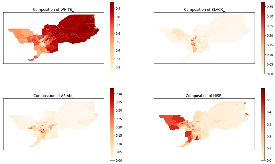
The groups of interest are White, Black, Asian and Hispanic population. Therefore, we create an auxiliary list with only the necessary columns for fitting the index.
groups_list = ['WHITE_', 'BLACK_', 'ASIAN_','HISP_']
We also can plot the spatial distribution of the composition of each of these groups over the tracts of Sacramento:
import matplotlib.pyplot as plt

for i in range(len(groups_list)):
    input_df['comp_' + groups_list[i]] = input_df[groups_list[i]] / input_df['TOT_POP']

fig, axes = plt.subplots(ncols = 2, nrows = 2, figsize = (17, 10))


input_df.plot(column = 'comp_' + groups_list[0],
              cmap = 'OrRd',
              legend = True, ax = axes[0,0])
axes[0,0].set_title('Composition of ' + groups_list[0])
axes[0,0].set_xticks([])
axes[0,0].set_yticks([])
axes[0,0].set_facecolor('white')


input_df.plot(column = 'comp_' + groups_list[1],
              cmap = 'OrRd',
              legend = True, ax = axes[0,1])
axes[0,1].set_title('Composition of ' + groups_list[1])
axes[0,1].set_xticks([])
axes[0,1].set_yticks([])
axes[0,1].set_facecolor('white')


input_df.plot(column = 'comp_' + groups_list[2],
              cmap = 'OrRd',
              legend = True, ax = axes[1,0])
axes[1,0].set_title('Composition of ' + groups_list[2])
axes[1,0].set_xticks([])
axes[1,0].set_yticks([])
axes[1,0].set_facecolor('white')

input_df.plot(column = 'comp_' + groups_list[3],
              cmap = 'OrRd',
              legend = True, ax = axes[1,1])
axes[1,1].set_title('Composition of ' + groups_list[3])
axes[1,1].set_xticks([])
axes[1,1].set_yticks([])
axes[1,1].set_facecolor('white')
%%capture
from segregation.aspatial import MultiDissim
index = MultiDissim(input_df, groups_list)
type(index)
index.statistic
%%capture
from segregation.aspatial import MultiGiniSeg
index = MultiGiniSeg(input_df, groups_list)
type(index)
index.statistic
%%capture
from segregation.aspatial import MultiNormalizedExposure
index = MultiNormalizedExposure(input_df, groups_list)
type(index)
index.statistic
%%capture
from segregation.aspatial import MultiInformationTheory
index = MultiInformationTheory(input_df, groups_list)
type(index)
index.statistic
%%capture
from segregation.aspatial import MultiRelativeDiversity
index = MultiRelativeDiversity(input_df, groups_list)
type(index)
index.statistic
%%capture
from segregation.aspatial import MultiSquaredCoefficientVariation
index = MultiSquaredCoefficientVariation(input_df, groups_list)
type(index)
index.statistic
%%capture
from segregation.aspatial import MultiDiversity
index = MultiDiversity(input_df, groups_list)
type(index)
index.statistic
# Normalized version of the multigroup diversity index
normalized_index = MultiDiversity(input_df, groups_list, normalized = True)
normalized_index.statistic
%%capture
from segregation.aspatial import SimpsonsConcentration
index = SimpsonsConcentration(input_df, groups_list)
type(index)
index.statistic
%%capture
from segregation.aspatial import SimpsonsInteraction
index = SimpsonsInteraction(input_df, groups_list)
type(index)
index.statistic
%%capture
from segregation.aspatial import MultiDivergence
index = MultiDivergence(input_df, groups_list)
type(index)
index.statistic