gini
import sys
import os
import matplotlib.pyplot as plt
%pylab inline
sys.path.append(os.path.abspath('..'))
import inequality
import libpysal
libpysal.examples.available()
libpysal.examples.explain('mexico')
import geopandas
pth = libpysal.examples.get_path("mexicojoin.shp")
gdf = geopandas.read_file(pth)

from libpysal.weights import Queen, Rook, KNN
%matplotlib inline
import matplotlib.pyplot as plt
ax = gdf.plot()
ax.set_axis_off()

gdf.head()
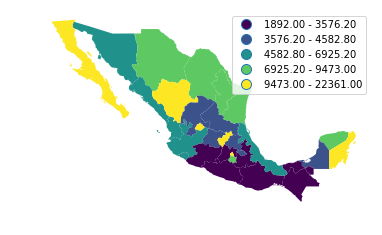
ax = gdf.plot(column='PCGDP1940',k=5,scheme='Quantiles',legend=True)
ax.set_axis_off()
#ax.set_title("PC GDP 1940")
plt.savefig('1940.png')
gini_1940 = inequality.gini.Gini(gdf['PCGDP1940'])
gini_1940.g
decades = range(1940, 2010, 10)
decades
ginis = [ inequality.gini.Gini(gdf["PCGDP%s"%decade]).g for decade in decades]
ginis
inequality.gini.Gini_Spatial
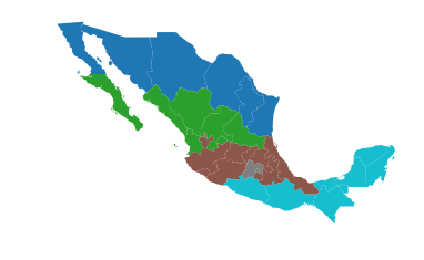
regimes = gdf['HANSON98']
w = libpysal.weights.block_weights(regimes)
ax = gdf.plot(column='HANSON98', categorical=True)
#ax.set_title('Regions')
ax.set_axis_off()
plt.savefig('regions.png')
import numpy as np
np.random.seed(12345)
gs = inequality.gini.Gini_Spatial(gdf['PCGDP1940'],w)
gs.p_sim
gs_all = [ inequality.gini.Gini_Spatial(gdf["PCGDP%s"%decade], w) for decade in decades]
p_values = [gs.p_sim for gs in gs_all]
p_values
wgs = [gs.wcg_share for gs in gs_all]
wgs
bgs = [ 1 - wg for wg in wgs]
bgs
%pylab inline
years = np.array(decades)
years
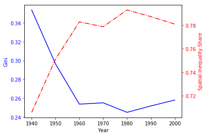
fig, ax1 = plt.subplots()
t = years
s1 = ginis
ax1.plot(t, s1, 'b-')
ax1.set_xlabel('Year')
# Make the y-axis label, ticks and tick labels match the line color.
ax1.set_ylabel('Gini', color='b')
ax1.tick_params('y', colors='b')

ax2 = ax1.twinx()
s2 = bgs
ax2.plot(t, s2, 'r-.')
ax2.set_ylabel('Spatial Inequality Share', color='r')
ax2.tick_params('y', colors='r')

fig.tight_layout()

plt.savefig('share.png')