This page was generated from notebooks/network-spatial-autocorrelation.ipynb.
Interactive online version:
![]()
If any part of this notebook is used in your research, please cite with the reference found in README.md.
Network-constrained spatial autocorrelation
Performing and visualizing exploratory spatial data analysis
Author: James D. Gaboardi jgaboardi@gmail.com
This notebook is an advanced walk-through for:
Demonstrating spatial autocorrelation with pysal/esda
Calculating Moran’s I on a segmented network
Visualizing spatial autocorrelation with pysal/splot for empirical and synthetic data
[1]:
%config InlineBackend.figure_format = "retina"
[2]:
%load_ext watermark
%watermark
Last updated: 2022-11-01T23:12:14.846009-04:00

Python implementation: CPython
Python version       : 3.10.6
IPython version      : 8.6.0

Compiler    : Clang 13.0.1
OS          : Darwin
Release     : 22.1.0
Machine     : x86_64
Processor   : i386
CPU cores   : 8
Architecture: 64bit
[3]:
import esda
import libpysal
import matplotlib
import matplotlib_scalebar
from matplotlib_scalebar.scalebar import ScaleBar
import numpy
import spaghetti
import splot

%matplotlib inline
%watermark -w
%watermark -iv
Watermark: 2.3.1

json               : 2.0.9
matplotlib_scalebar: 0.8.0
splot              : 1.1.5.post1
numpy              : 1.23.4
spaghetti          : 1.6.8
matplotlib         : 3.6.1
libpysal           : 4.6.2
esda               : 2.4.3
/Users/the-gaboardi/miniconda3/envs/py310_spgh_dev/lib/python3.10/site-packages/spaghetti/network.py:39: FutureWarning: The next major release of pysal/spaghetti (2.0.0) will drop support for all ``libpysal.cg`` geometries. This change is a first step in refactoring ``spaghetti`` that is expected to result in dramatically reduced runtimes for network instantiation and operations. Users currently requiring network and point pattern input as ``libpysal.cg`` geometries should prepare for this simply by converting to ``shapely`` geometries.
  warnings.warn(f"{dep_msg}", FutureWarning)
Instantiating a spaghetti.Network object and a point pattern
Instantiate the network from a .shp file
[4]:
ntw = spaghetti.Network(in_data=libpysal.examples.get_path("streets.shp"))
ntw
[4]:
<spaghetti.network.Network at 0x10461d7e0>
Extract network arcs as a geopandas.GeoDataFrame
[5]:
_, arc_df = spaghetti.element_as_gdf(ntw, vertices=True, arcs=True)
arc_df.head()
[5]:
| id | geometry | comp_label | |
|---|---|---|---|
| 0 | (0, 1) | LINESTRING (728368.048 877125.895, 728368.139 ... | 0 |
| 1 | (0, 2) | LINESTRING (728368.048 877125.895, 728367.458 ... | 0 |
| 2 | (1, 110) | LINESTRING (728368.139 877023.272, 728612.255 ... | 0 |
| 3 | (1, 127) | LINESTRING (728368.139 877023.272, 727708.140 ... | 0 |
| 4 | (1, 213) | LINESTRING (728368.139 877023.272, 728368.729 ... | 0 |
Associate the network with a point pattern
[6]:
pp_name = "crimes"
pp_shp = libpysal.examples.get_path("%s.shp" % pp_name)
ntw.snapobservations(pp_shp, pp_name, attribute=True)
ntw.pointpatterns
[6]:
{'crimes': <spaghetti.network.PointPattern at 0x15ae0f340>}
Extract the crimes point pattern as a geopandas.GeoDataFrame
[7]:
pp_df = spaghetti.element_as_gdf(ntw, pp_name=pp_name)
pp_df.head()
[7]:
| id | geometry | comp_label | |
|---|---|---|---|
| 0 | 0 | POINT (727913.000 875721.000) | 0 |
| 1 | 1 | POINT (724812.000 875763.000) | 0 |
| 2 | 2 | POINT (727391.000 875853.000) | 0 |
| 3 | 3 | POINT (728017.000 875858.000) | 0 |
| 4 | 4 | POINT (727525.000 875860.000) | 0 |
1. ESDA — Exploratory Spatial Data Analysis with pysal/esda
The Moran’s I test statistic allows for the inference of how clustered (or dispersed) a dataset is while considering both attribute values and spatial relationships. A value of closer to +1 indicates absolute clustering while a value of closer to -1 indicates absolute dispersion. Complete spatial randomness takes the value of 0. See the esda documentation for in-depth descriptions and tutorials.
Moran’s I using the network representation’s W
[8]:
moran_ntwwn, yaxis_ntwwn = ntw.Moran(pp_name)
moran_ntwwn.I
[8]:
0.005192687496078421
Moran’s I using the graph representation’s W
[9]:
moran_ntwwg, yaxis_ntwwg = ntw.Moran(pp_name, graph=True)
moran_ntwwg.I
[9]:
0.004777863137379377
Interpretation:
Although both the network and graph representations (
moran_ntwwnandmoran_ntwwg, respectively) display minimal postive spatial autocorrelation, a slighly lower value is observed in the graph represention. This is likely due to more direct connectivity in the graph representation; a direct result of eliminating degree-2 vertices. The Moran’s I for both the network and graph representations suggest that network arcs/graph edges attributed with associated crime counts are nearly randomly distributed.
2. Moran’s I on a segmented network
Moran’s I on a network split into 200-foot segments
[10]:
n200 = ntw.split_arcs(200.0)
n200
[10]:
<spaghetti.network.Network at 0x15aea5ae0>
[11]:
moran_n200, yaxis_n200 = n200.Moran(pp_name)
moran_n200.I
[11]:
0.008782712541437603
Moran’s I on a network split into 50-foot segments
[12]:
n50 = ntw.split_arcs(50.0)
n50
[12]:
<spaghetti.network.Network at 0x15af2e560>
[13]:
moran_n50, yaxis_n50 = n50.Moran(pp_name)
moran_n50.I
[13]:
0.004821223431200421
Interpretation:
Contrary to above, both the 200-foot and 50-foot segmented networks (
moran_n200andmoran_n50, respectively) display minimal positive spatial autocorrelation, with slighly higher values being observed in the 200-foot representation. However, similar to above the Moran’s I for both the these representations suggest that network arcs attributed with associated crime counts are nearly randomly distributed.
3. Visualizing ESDA with splot
Here we are demonstrating spatial lag, which refers to attribute similarity. See the splot documentation for in-depth descriptions and tutorials. In this first section empirical data is utilized followed by a highly-clusterd synthetic example.
[14]:
from splot.esda import moran_scatterplot, lisa_cluster, plot_moran
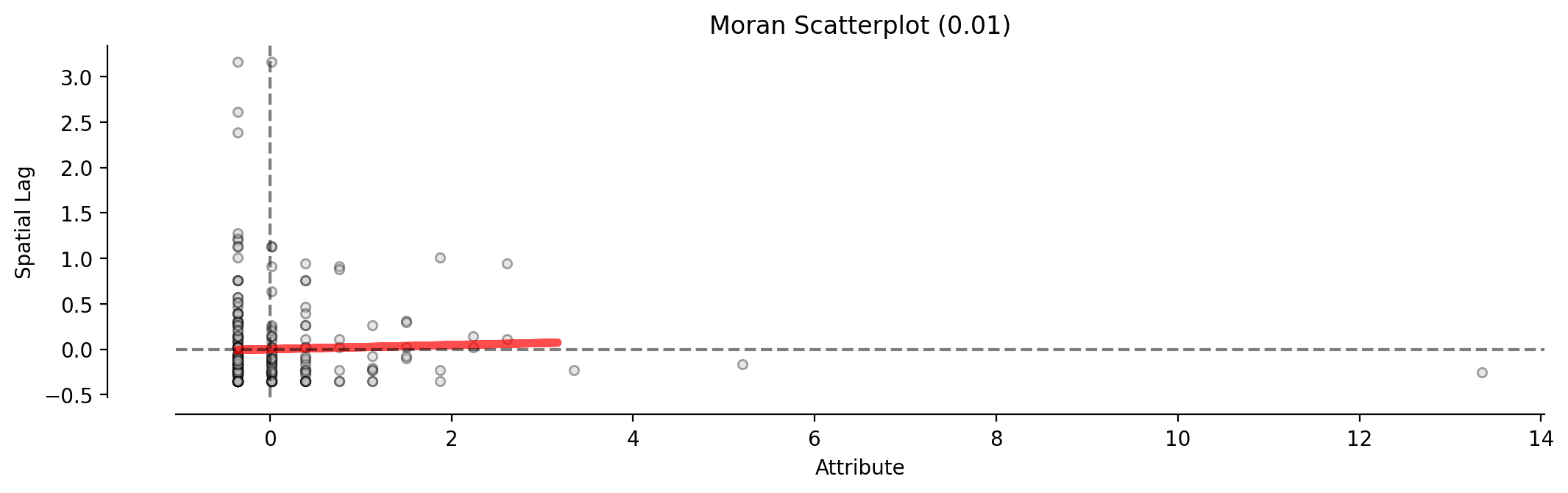
Moran scatterplot
Plotted with equal aspect
[15]:
figsize = (12,6)
fig, ax = matplotlib.pyplot.subplots(figsize=figsize)
fitline_kwds = {"color":"r", "lw": 4, "alpha":.7}
scatter_kwds = {"s":20, "edgecolors":"k", "alpha":.35}
pltkwds = {"fitline_kwds": fitline_kwds, "scatter_kwds": scatter_kwds}
moran_scatterplot(moran_ntwwn, aspect_equal=True, ax=ax, **pltkwds);
Plotted without equal aspect
[16]:
fig, ax = matplotlib.pyplot.subplots(figsize=figsize)
moran_scatterplot(moran_ntwwn, aspect_equal=False, ax=ax, **pltkwds);
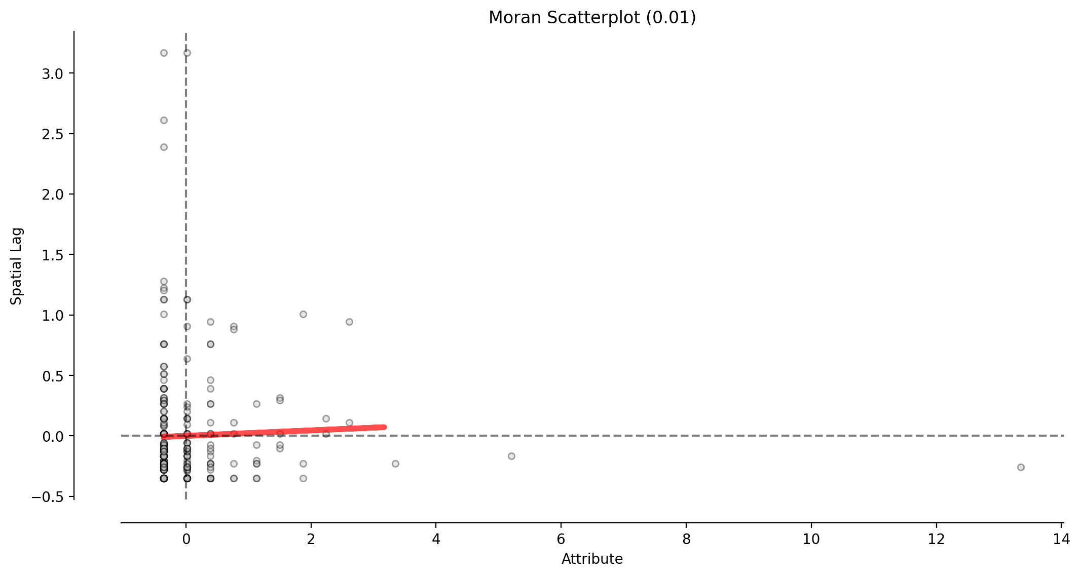
This scatterplot demostrates the attribute values and associated attribute similarities in space (spatial lag) for the network representation’s W (moran_ntwwn).
Reference distribution and Moran scatterplot
[17]:
plot_moran(moran_ntwwn, zstandard=True, figsize=figsize, **pltkwds);
/Users/the-gaboardi/miniconda3/envs/py310_spgh_dev/lib/python3.10/site-packages/splot/_viz_esda_mpl.py:354: FutureWarning:

`shade` is now deprecated in favor of `fill`; setting `fill=True`.
This will become an error in seaborn v0.14.0; please update your code.

  sbn.kdeplot(moran.sim, shade=shade, color=color, ax=ax, **kwargs)
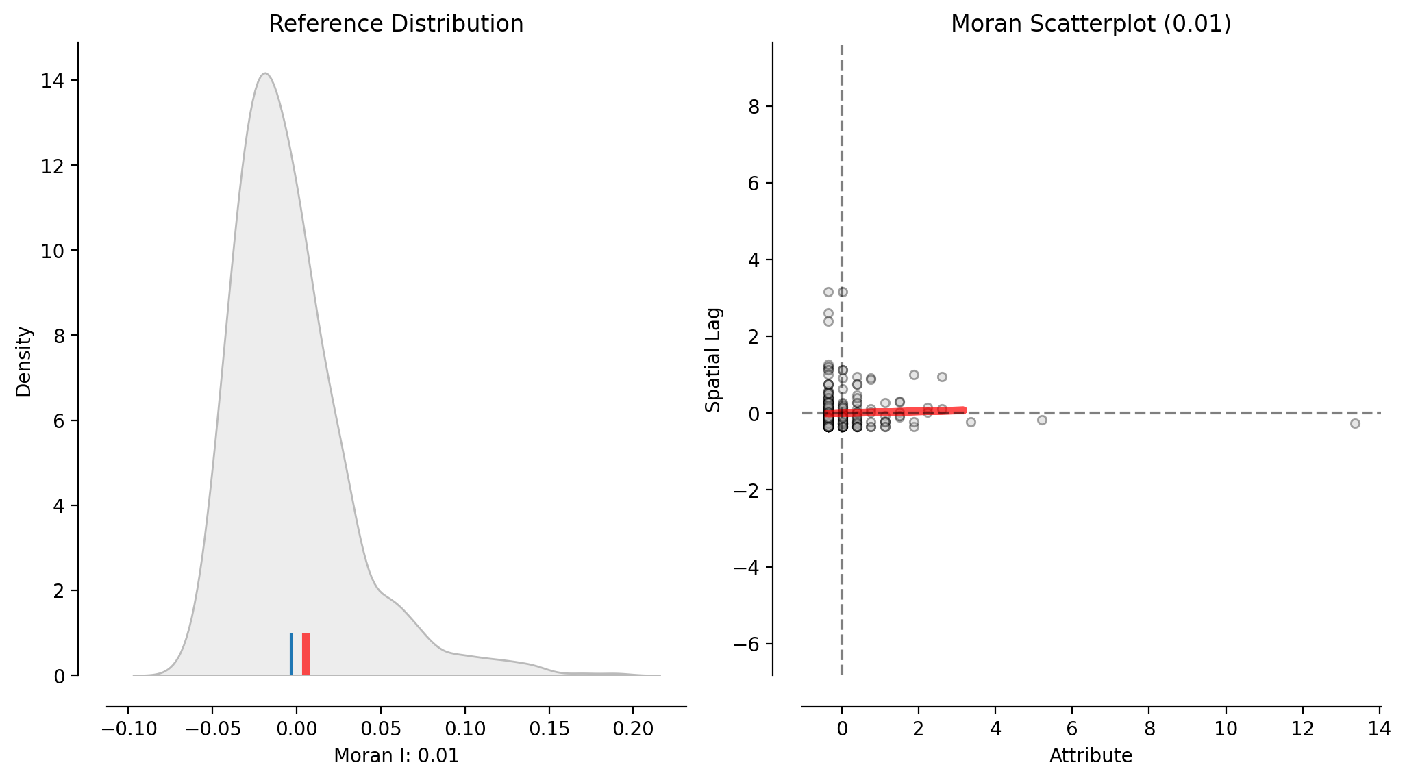
This figure incorporates the reference distribution of Moran’s I values into the above scatterplot of the network representation’s W (moran_ntwwn).
Local Moran’s l
The demonstrations above considered the dataset as a whole, providing a global measure. The following demostrates the consideration of local spatial autocorrelation, providing a measure for each observation. This is best interpreted visually, here with another scatterplot colored to indicate relationship type.
Plotted with equal aspect
[18]:
p = 0.05
moran_loc_ntwwn = esda.moran.Moran_Local(yaxis_ntwwn, ntw.w_network)
fig, ax = matplotlib.pyplot.subplots(figsize=figsize)
moran_scatterplot(moran_loc_ntwwn, p=p, aspect_equal=True, ax=ax)
ax.set(xlabel="Crimes", ylabel="Spatial Lag of Crimes");

Plotted without equal aspect
[19]:
fig, ax = matplotlib.pyplot.subplots(figsize=figsize)
moran_scatterplot(moran_loc_ntwwn, p=p, aspect_equal=False, ax=ax)
ax.set(xlabel="Crimes", ylabel="Spatial Lag of Crimes");
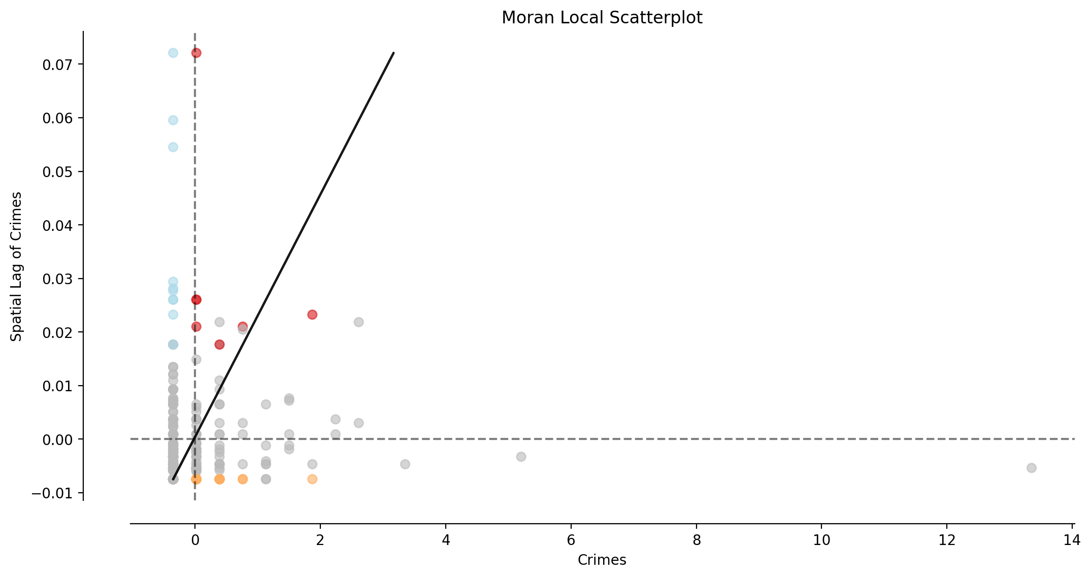
Interpretation:
The majority of observations (network arcs) display no significant local spatial autocorrelation (shown in gray).
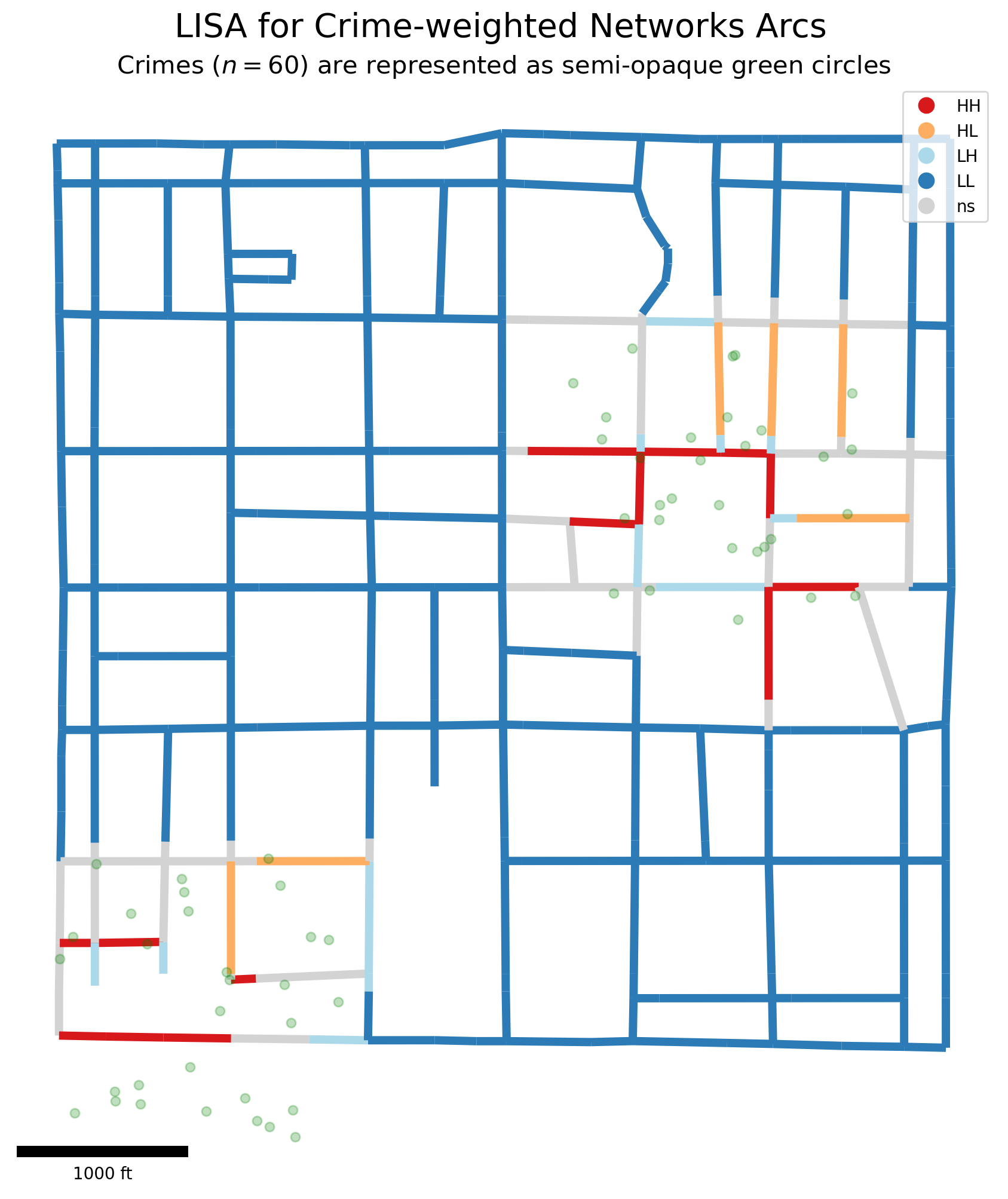
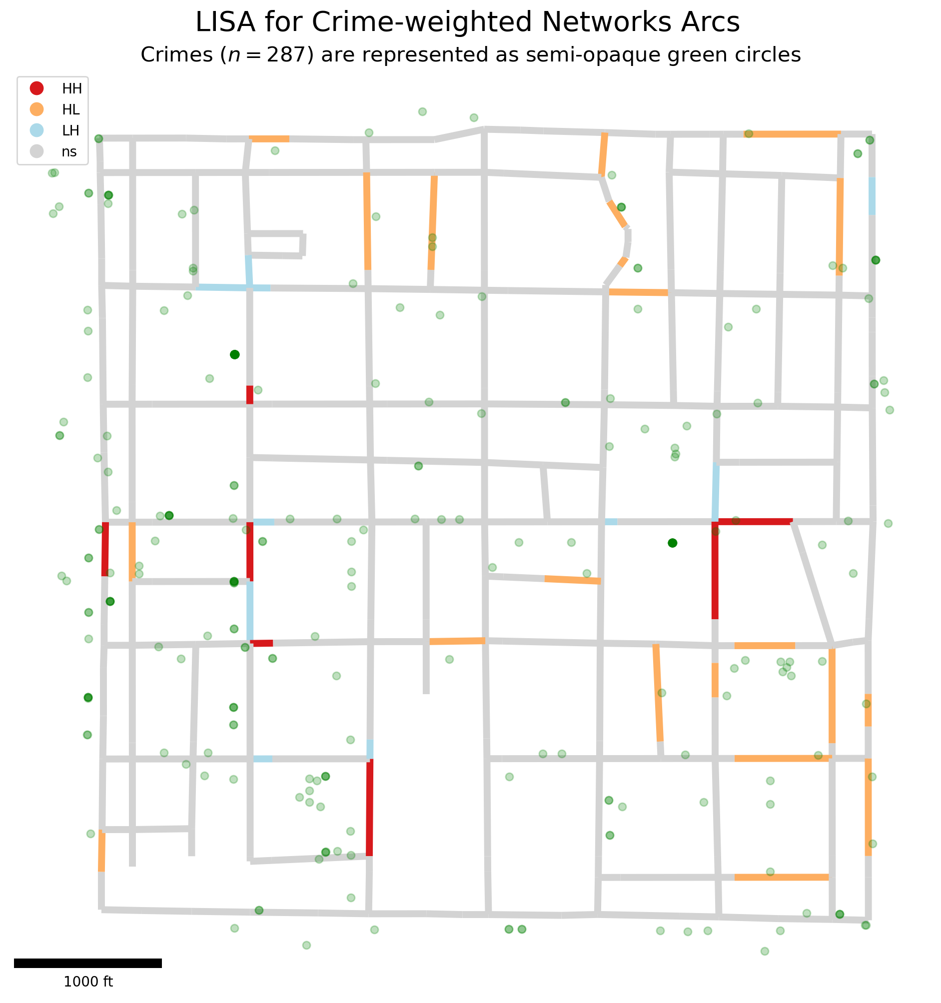
Plotting Local Indicators of Spatial Autocorrelation (LISA)
[20]:
lisa_args = moran_loc_ntwwn, arc_df.copy()
lisa_kwds = {"p":p, "figsize":(12,12), "lw":5, "zorder":0}
f, ax = lisa_cluster(*lisa_args, **lisa_kwds)
pp_df.plot(ax=ax, alpha=.25, color="g", markersize=30, zorder=1)
suptitle = "LISA for Crime-weighted Networks Arcs"
matplotlib.pyplot.suptitle(suptitle, fontsize=20, x=.51, y=.93)
subtitle = "Crimes ($n=%s$) are represented as semi-opaque green circles"
matplotlib.pyplot.title(subtitle % pp_df.shape[0], fontsize=15)
sbkw = {"units":"ft", "dimension":"imperial-length", "fixed_value":1000}
sbkw.update({"location":"lower left", "box_alpha":.75})
ax.add_artist(matplotlib_scalebar.scalebar.ScaleBar(1, **sbkw));
A highly-clustered synthetic example
[21]:
ncrimes, cluster_crimes = 30, []; numpy.random.seed(0)
minx, miny, maxx, maxy = [725400, 877400, 727100, 879100]
for c in range(ncrimes):
    for plus_minus in [1000, -2000]:
        x = numpy.random.uniform(minx+plus_minus, maxx+plus_minus)
        y = numpy.random.uniform(miny+plus_minus, maxy+plus_minus)
        cluster_crimes.append(libpysal.cg.Point((x,y)))
[22]:
ntw.snapobservations(cluster_crimes, pp_name, attribute=True)
moran_ntwwn, yaxis_ntwwn = ntw.Moran(pp_name)
moran_loc_ntwwn = esda.moran.Moran_Local(yaxis_ntwwn, ntw.w_network)
pp_df = spaghetti.element_as_gdf(ntw, pp_name=pp_name)
[23]:
lisa_args = moran_loc_ntwwn, arc_df
f, ax = lisa_cluster(*lisa_args, **lisa_kwds)
pp_df.plot(ax=ax, zorder=1, alpha=.25, color="g", markersize=30)
matplotlib.pyplot.suptitle(suptitle, fontsize=20, x=.51, y=.93)
matplotlib.pyplot.title(subtitle % pp_df.shape[0], fontsize=15)
ax.add_artist(matplotlib_scalebar.scalebar.ScaleBar(1, **sbkw));