Segregation Index Decomposition
Table of Contents
Decomposition framework of the PySAL segregation module
This is a notebook that explains a step-by-step procedure to perform decomposition on comparative segregation measures.
First, let’s import all the needed libraries.
[1]:
import pandas as pd
import pickle
import numpy as np
import matplotlib.pyplot as plt

import segregation
from segregation.decomposition import DecomposeSegregation
In this example, we are going to use census data that the user must download its own copy, following similar guidelines explained in https://github.com/spatialucr/geosnap/blob/master/examples/01_getting_started.ipynb where you should download the full type file of 2010. The zipped file download will have a name that looks like LTDB_Std_All_fullcount.zip. After extracting the zipped content, the filepath of the data should looks like this:
[2]:
#filepath = '~/LTDB_Std_2010_fullcount.csv'
Then, we read the data:
[4]:
df = pd.read_csv(filepath, encoding = "ISO-8859-1", sep = ",")
We are going to work with the variable of the nonhispanic black people (nhblk10) and the total population of each unit (pop10). So, let’s read the map of all census tracts of US and select some specific columns for the analysis:
[5]:
# This file can be download here: https://drive.google.com/open?id=1gWF0OCn6xuR_WrEj7Ot2jY6KI2t6taIm
with open('data/tracts_US.pkl', 'rb') as input:
    map_gpd = pickle.load(input)

map_gpd['INTGEOID10'] = pd.to_numeric(map_gpd["GEOID10"])
gdf_pre = map_gpd.merge(df, left_on = 'INTGEOID10', right_on = 'tractid')
gdf = gdf_pre[['GEOID10', 'geometry', 'pop10', 'nhblk10']]
In this notebook, we use the Metropolitan Statistical Area (MSA) of US (we’re also using the word ‘cities’ here to refer them). So, let’s read the correspondence table that relates the tract id with the corresponding Metropolitan area…
[6]:
# You can download this file here: https://drive.google.com/open?id=10HUUJSy9dkZS6m4vCVZ-8GiwH0EXqIau
with open('data/tract_metro_corresp.pkl', 'rb') as input:
    tract_metro_corresp = pickle.load(input).drop_duplicates()
..and merge them with the previous data.
[7]:
merged_gdf = gdf.merge(tract_metro_corresp, left_on = 'GEOID10', right_on = 'geoid10')
We now build the composition variable (compo) which is the division of the frequency of the chosen group and total population. Let’s inspect the first rows of the data.
[8]:
merged_gdf['compo'] = np.where(merged_gdf['pop10'] == 0, 0, merged_gdf['nhblk10'] / merged_gdf['pop10'])
merged_gdf.head()
[8]:
| GEOID10 | geometry | pop10 | nhblk10 | geoid10 | metro_id | numeric_id | geoid | name | compo | |
|---|---|---|---|---|---|---|---|---|---|---|
| 0 | 01001020801 | POLYGON ((-86.456273 32.405837, -86.4570349999... | 3081 | 293 | 01001020801 | 33860 | 33860 | 33860 | Montgomery, AL | 0.095099 |
| 1 | 01001020802 | POLYGON ((-86.412497 32.589422, -86.412442 32.... | 10435 | 1420 | 01001020802 | 33860 | 33860 | 33860 | Montgomery, AL | 0.136080 |
| 2 | 01001020200 | POLYGON ((-86.467354 32.459308, -86.46764 32.4... | 2170 | 1226 | 01001020200 | 33860 | 33860 | 33860 | Montgomery, AL | 0.564977 |
| 3 | 01001020700 | POLYGON ((-86.46106999999999 32.42709, -86.461... | 2891 | 452 | 01001020700 | 33860 | 33860 | 33860 | Montgomery, AL | 0.156347 |
| 4 | 01001020600 | POLYGON ((-86.470524 32.456117, -86.4700469999... | 3668 | 776 | 01001020600 | 33860 | 33860 | 33860 | Montgomery, AL | 0.211559 |
Now, we chose two different metropolitan areas to compare the degree of segregation.
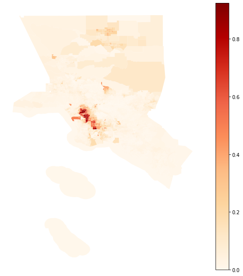
Map of the composition of the Metropolitan area of Los Angeles
[9]:
la_2010 = merged_gdf.loc[(merged_gdf.name == "Los Angeles-Long Beach-Anaheim, CA")]
la_2010.plot(column = 'compo', figsize = (10, 10), cmap = 'OrRd', legend = True)
plt.axis('off')
[9]:
(-119.02865769999998, -117.3360503, 32.6463769, 34.9269651)
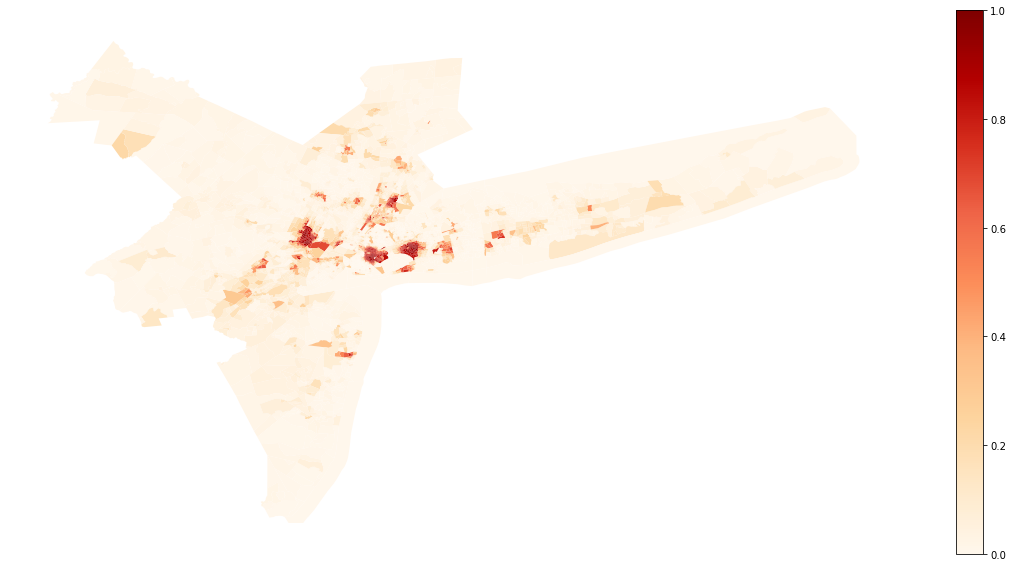
Map of the composition of the Metropolitan area of New York
[10]:
ny_2010 = merged_gdf.loc[(merged_gdf.name == 'New York-Newark-Jersey City, NY-NJ-PA')]
ny_2010.plot(column = 'compo', figsize = (20, 10), cmap = 'OrRd', legend = True)
plt.axis('off')
[10]:
(-75.5381038, -71.59841419999998, 39.36886419999999, 41.70820779999999)
We first compare the Gini index of both cities. Let’s import the Gini_Seg class from segregation, fit both indexes and check the difference in point estimation.
[11]:
from segregation.aspatial import GiniSeg

G_la = GiniSeg(la_2010, 'nhblk10', 'pop10')
G_ny = GiniSeg(ny_2010, 'nhblk10', 'pop10')

G_la.statistic - G_ny.statistic
[11]:
-0.10652888790131243
Let’s decompose these difference according to Rey, S. et al “Comparative Spatial Segregation Analytics”. Forthcoming. You can check the options available in this decomposition below:
[12]:
help(DecomposeSegregation)
Help on class DecomposeSegregation in module segregation.decomposition.decompose_segregation:

class DecomposeSegregation(builtins.object)
 |  Decompose segregation differences into spatial and attribute components.
 |
 |  Given two segregation indices of the same type, use Shapley decomposition
 |  to measure whether the differences between index measures arise from
 |  differences in spatial structure or population structure
 |
 |  Parameters
 |  ----------
 |  index1 : segregation.SegIndex class
 |      First SegIndex class to compare.
 |  index2 : segregation.SegIndex class
 |      Second SegIndex class to compare.
 |  counterfactual_approach : str, one of
 |                            ["composition", "share", "dual_composition"]
 |      The technique used to generate the counterfactual population
 |      distributions.
 |
 |  Attributes
 |  ----------
 |
 |  c_s : float
 |      Shapley's Spatial Component of the decomposition
 |
 |  c_a : float
 |      Shapley's Attribute Component of the decomposition
 |
 |  Methods
 |  ----------
 |
 |  plot : Visualize features of the Decomposition performed
 |      plot_type : str, one of ['cdfs', 'maps']
 |
 |      'cdfs' : visualize the cumulative distribution functions of the compositions/shares
 |      'maps' : visualize the spatial distributions for original data and counterfactuals generated and Shapley's components (only available for GeoDataFrames)
 |
 |  Examples
 |  --------
 |  Several examples can be found at https://github.com/pysal/segregation/blob/master/notebooks/decomposition_wrapper_example.ipynb.
 |
 |  Methods defined here:
 |
 |  __init__(self, index1, index2, counterfactual_approach='composition')
 |      Initialize self.  See help(type(self)) for accurate signature.
 |
 |  plot(self, plot_type='cdfs')
 |      Plot the Segregation Decomposition Profile
 |
 |  ----------------------------------------------------------------------
 |  Data descriptors defined here:
 |
 |  __dict__
 |      dictionary for instance variables (if defined)
 |
 |  __weakref__
 |      list of weak references to the object (if defined)
Composition Approach (default)
The difference of -0.10653 fitted previously, can be decomposed into two components. The Spatial component and the attribute component. Let’s estimate both, respectively.
[13]:
DS_composition = DecomposeSegregation(G_la, G_ny)
DS_composition.c_s
[13]:
0.029575766160051364
[14]:
DS_composition.c_a
[14]:
-0.1361046540613638
So, the first thing to notice is that attribute component, i.e., given by a difference in the population structure (in this case, the composition) plays a more important role in the difference, since it has a higher absolute value.
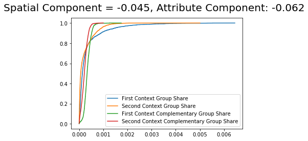
The difference in the composition can be inspected in the plotting method with the type cdfs:
[15]:
DS_composition.plot(plot_type = 'cdfs')
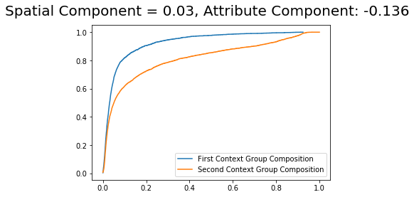
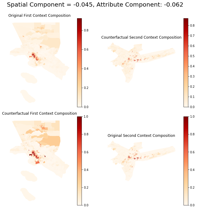
If your data is a GeoDataFrame, it is also possible to visualize the counterfactual compositions with the argument plot_type = 'maps'
The first and second contexts are Los Angeles and New York, respectively.
[16]:
DS_composition.plot(plot_type = 'maps')

Note that in all plotting methods, the title presents each component of the decomposition performed.
Dual Composition Approach
The dual_composition approach is similar to the composition approach. However, it uses also the counterfactual composition of the cdf of the complementary group.
[19]:
DS_dual = DecomposeSegregation(G_la, G_ny, counterfactual_approach = 'dual_composition')
DS_dual.plot(plot_type = 'cdfs')
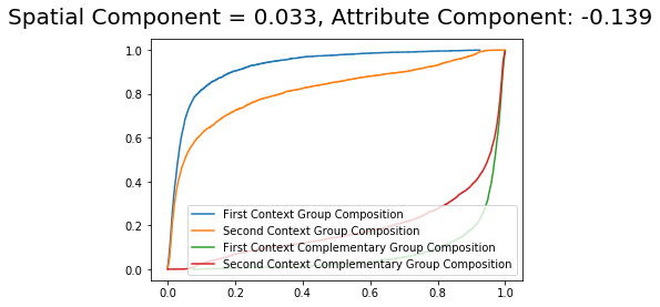
It is possible to see that the component values are very similar with slight changes from the composition approach.
[20]:
DS_dual.plot(plot_type = 'maps')
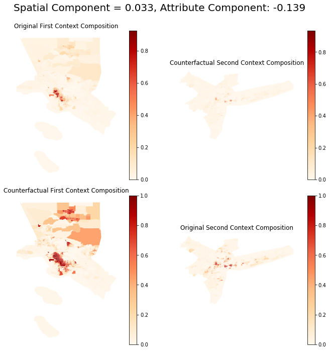
The counterfactual distributions are virtually the same (but not equal) as the one from the composition approach.
Inspecting a different index: Relative Concentration
[21]:
from segregation.spatial import RelativeConcentration

RCO_la = RelativeConcentration(la_2010, 'nhblk10', 'pop10')
RCO_ny = RelativeConcentration(ny_2010, 'nhblk10', 'pop10')

RCO_la.statistic - RCO_ny.statistic
[21]:
-0.4252237137424809
[22]:
RCO_DS_composition = DecomposeSegregation(RCO_la, RCO_ny)
RCO_DS_composition.c_s
[22]:
-0.37586237172215886
[23]:
RCO_DS_composition.c_a
[23]:
-0.049361342020322
It is possible to note that, in this case, the spatial component is playing a much more relevant role in the decomposition.
