Multiscalar Segregation Profiles
[1]:
%load_ext watermark
%watermark -a 'eli knaap' -v -d -u -p segregation,geopandas,libpysal,pandana
Author: eli knaap

Last updated: 2021-05-11

Python implementation: CPython
Python version       : 3.9.2
IPython version      : 7.23.1

segregation: 2.0.0
geopandas  : 0.9.0
libpysal   : 4.3.0
pandana    : 0.6.1
For measuring spatial segregation dynamics, the segregation package provides a function for measuring multiscalar segregation profiles, as introduced by Reardon et al. The multiscalar profile is a tool for measuring spatial segregation dynamics–the way that a segregation index changes values as the concept of a neighborhood changes, and what that tells us about macro versus micro patterns of segregation.
The basic idea is to calculate a segregation statistic, then expand the spatial scope of a neighborhood, recalculate the statistic, and repeat. A multiscalar profile can be computed for any generalized spatial segregation index, which in the case of the segregation package, means a total of 23 indices, including single and multigroup varieties
[2]:
from segregation.batch import implicit_multi_indices, implicit_single_indices
[3]:
len(implicit_single_indices) + len(implicit_multi_indices)
[3]:
23
Computing a Single Group Profile
[4]:
import geopandas as gpd
import matplotlib.pyplot as plt

from libpysal.examples import load_example
from segregation.singlegroup import Dissim, Gini
from segregation.dynamics import compute_multiscalar_profile
[5]:
sacramento = gpd.read_file(load_example("Sacramento1").get_path("sacramentot2.shp"))
sacramento = sacramento.to_crs(sacramento.estimate_utm_crs())
[6]:
sac_gini_profile =  compute_multiscalar_profile(sacramento, segregation_index=Gini,
                                                group_pop_var="BLACK", total_pop_var="TOT_POP",
                                                distances= range(500,5500,500))
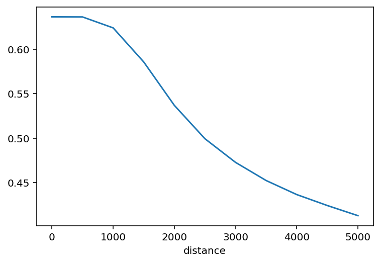
The function returns a pandas Series whose index is the neighborhood distance threshold, and the value is the segregation statistic.
[7]:
sac_gini_profile
[7]:
distance
0       0.636176
500     0.636064
1000    0.623789
1500    0.585520
2000    0.536810
2500    0.499351
3000    0.472796
3500    0.452424
4000    0.436661
4500    0.424358
5000    0.412987
Name: Gini, dtype: float64
As such, the profile is easy to plot:
[8]:
sac_gini_profile.plot()
[8]:
<AxesSubplot:xlabel='distance'>
A good way to compare multiscalar profiles is to plot them in the same figure. For example to compare profiles for gini and dissimilarity indices:
[9]:
sac_dissim_profile = compute_multiscalar_profile(sacramento, segregation_index=Dissim,
                                                group_pop_var="BLACK", total_pop_var="TOT_POP",
                                                distances= range(500,5500,500))
[10]:
from libpysal.weights import DistanceBand
[11]:
fig, ax = plt.subplots(figsize=(8,8))

sac_dissim_profile.plot(ax=ax)
sac_gini_profile.plot(ax=ax)
ax.legend()
[11]:
<matplotlib.legend.Legend at 0x1b2873520>
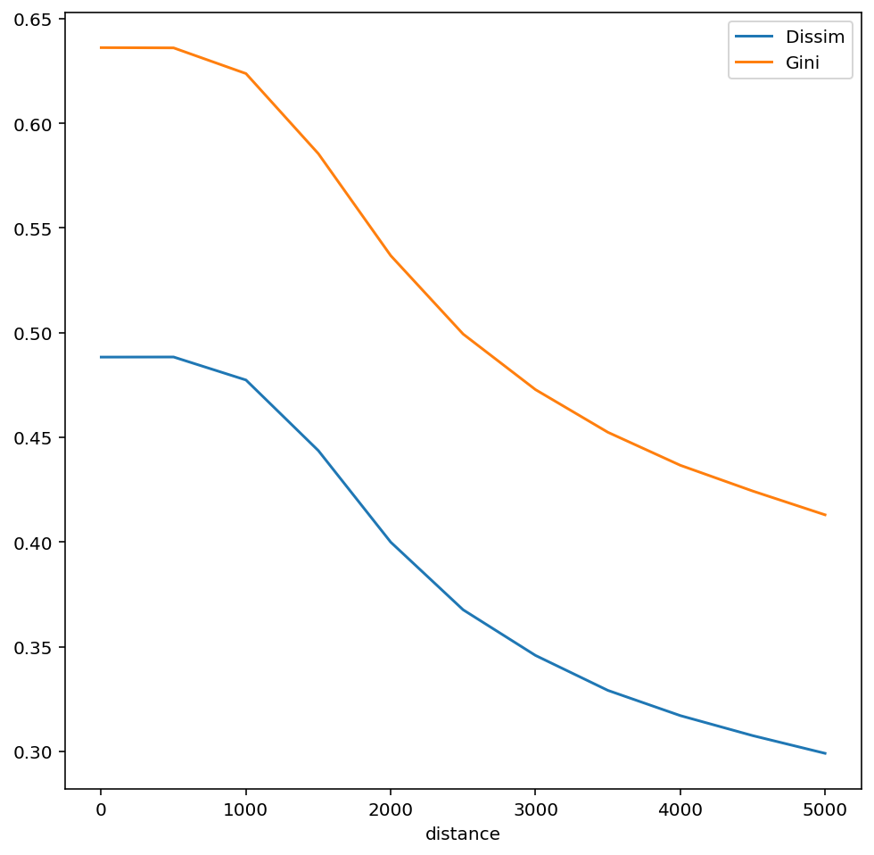
The multiscalar profiles for Gini and Dissimilarity indices are very similar, but have slightly different shapes.
Network versus Euclidian Multiscalar Profiles
To calculate a multiscalar profile using travel network distance instead of Euclidian distance, simply pass a pandana.Network object to the function
[12]:
import pandana as pdna
[13]:
net = pdna.Network.from_hdf5("../40900.h5")
[14]:
net_dissim_profile = compute_multiscalar_profile(sacramento, segregation_index=Dissim,
                                                group_pop_var="BLACK", total_pop_var="TOT_POP",
                                                network = net,
                                                distances= range(500,5500,500))
[15]:
fig, ax = plt.subplots(figsize=(8,8))

sac_dissim_profile.name='Dissim'
net_dissim_profile.name='Network Dissim'
sac_dissim_profile.plot(ax=ax)
net_dissim_profile.plot(ax=ax)
ax.legend()
[15]:
<matplotlib.legend.Legend at 0x1b28f0d60>
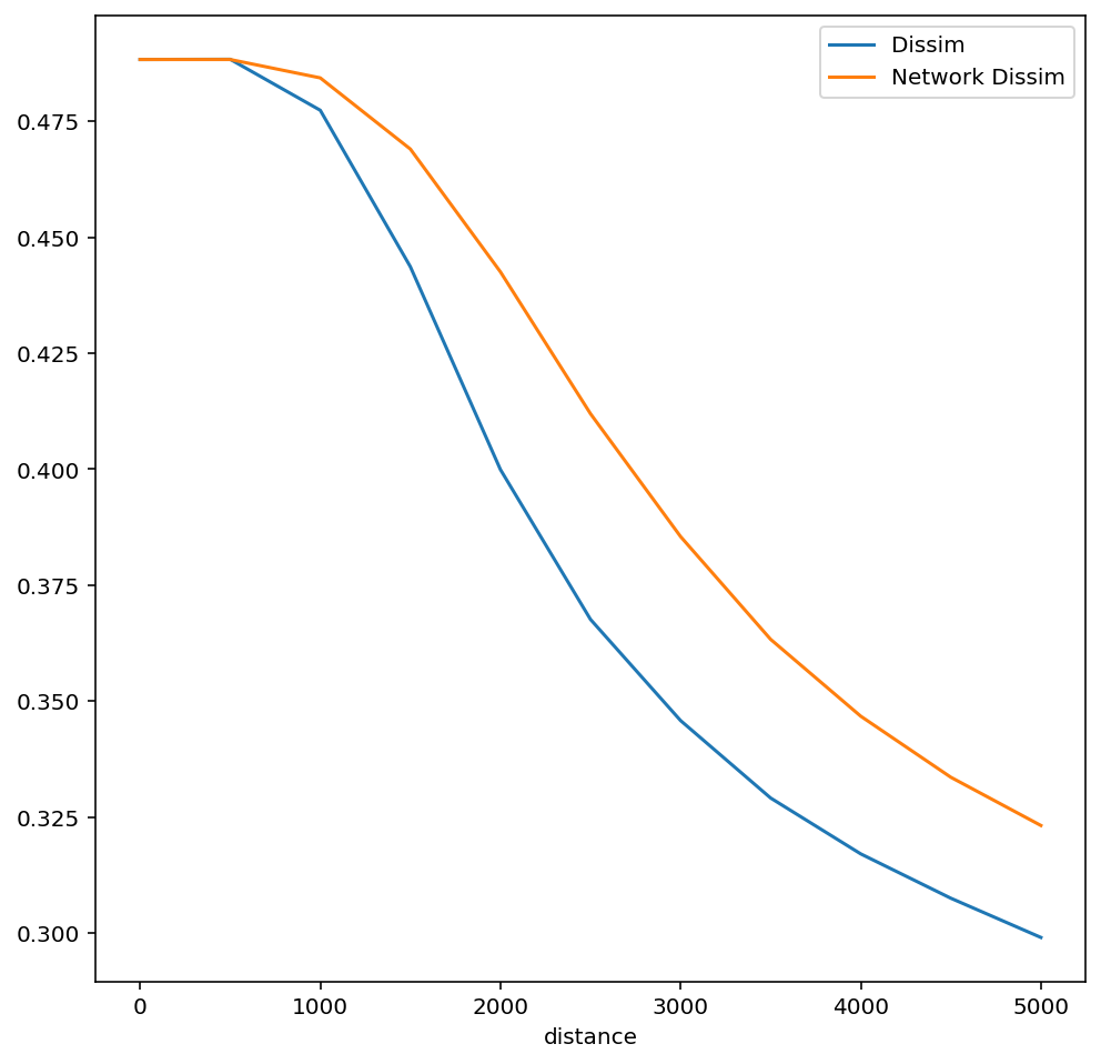
In this case, comparing the two profiles reveals the role of travel infrastructure on the experience and measurement of segregation; the network-based dissimilarity profile falls slower, indicating that travel networks help insulate segregation at larger distances
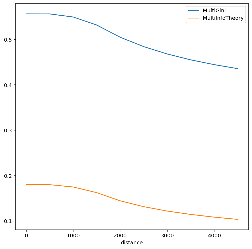
Computing a Multi Group Profile
To calculate a multigroup index (e.g. the multigroup information theory index from the original paper), simply pass a MultiGroupIndex class to the function with multigroup arguments instead of singlegroup
[16]:
from segregation.multigroup import MultiInfoTheory, MultiGini
[17]:
multi_info_profile = compute_multiscalar_profile(sacramento, segregation_index=MultiInfoTheory,
                                          groups=["HISP", 'BLACK', "WHITE"], distances=range(500,5000,500))

multi_gini_profile = compute_multiscalar_profile(sacramento, segregation_index=MultiGini,
                                          groups=["HISP", 'BLACK', "WHITE"], distances=range(500,5000,500))
[18]:
fig, ax = plt.subplots(figsize=(8,8))

multi_gini_profile.plot(ax=ax)
multi_info_profile.plot(ax=ax)
ax.legend()
[18]:
<matplotlib.legend.Legend at 0x1b2d5ca00>
Batch-Computing Profiles
[19]:
from segregation.batch import batch_multiscalar_singlegroup, batch_multiscalar_multigroup
[20]:
single_profs =  batch_multiscalar_singlegroup(sacramento,group_pop_var="BLACK", total_pop_var="TOT_POP",
                                                distances= range(500,5500,500))
[21]:
multi_profs = batch_multiscalar_multigroup(sacramento, distances=range(500,5000,500), groups=["HISP", 'BLACK', "WHITE"])
With several profiles to examine at once, it’s helpful to use an interactive plotting library like hvplot
[22]:
import hvplot.pandas
[23]:
single_profs.hvplot(width=850, height=450)
[23]:
[24]:
multi_profs.hvplot(width=850, height=550)
[24]:
[ ]:
[ ]: