Local Spatial Autocorrelation with Geary’s \(C_i\)
This notebook focuses on local indicators of spatial association (LISA) using Geary’s \(C_i\).
Learning goals
By the end of this notebook, you will be able to:
compute local Geary statistics for each areal unit
interpret local Geary cluster and outlier categories
identify statistically significant local clusters and spatial outliers using Geary’s \(C_i\)
distinguish global evidence of autocorrelation from local patterns
Local indicators of spatial association (LISA) answer the question that global Geary’s \(C\) cannot: where is the clustering occurring?
import warnings

import geopandas as gpd
import matplotlib.pyplot as plt
import numpy as np
from libpysal import graph

warnings.filterwarnings("ignore")

import esda
Our data set comes from the Berlin airbnb scrape taken in April 2018. This dataframe was constructed as part of the GeoPython 2018 workshop by Levi Wolf and Serge Rey. As part of the workshop a geopandas data frame was constructed with one of the columns reporting the median listing price of units in each neighborhood in Berlin:
Data preparation
We use the same Berlin neighborhood data and median Airbnb price variable as in the global analysis. Keeping the data and weights constant makes it easier to connect the local results back to the global Geary’s \(C\) statistic.
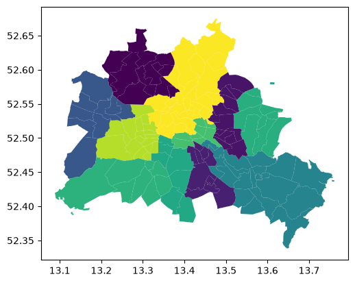
df = gpd.read_file("data/berlin-housing.gpkg")
df.plot(column="median_pri")
<Axes: >
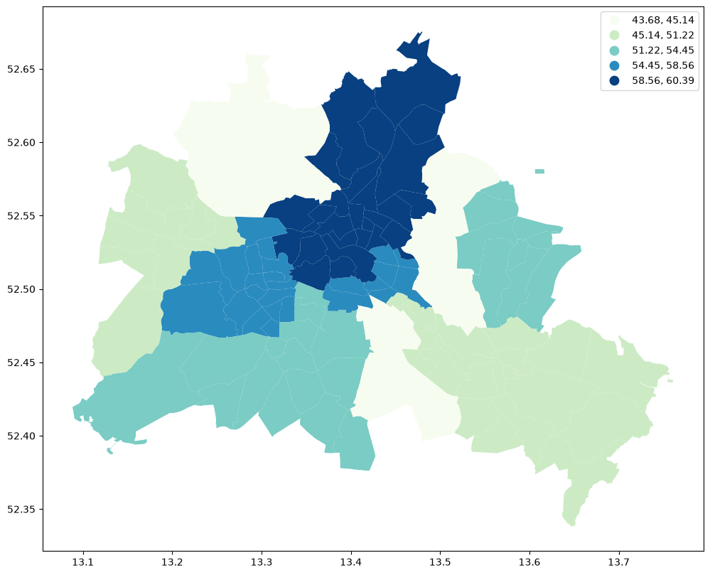
df.plot(
    column="median_pri",
    scheme="Quantiles",
    k=5,
    cmap="GnBu",
    legend=True,
    figsize=(12, 10),
)
<Axes: >
From global to local autocorrelation
A significant global statistic tells us that the map is spatially structured overall, but it does not reveal which neighborhoods are driving that result. Local Geary statistics decompose that global pattern into unit-level contributions.
Why Geary’s C?
Moran’s \(I\) measures spatial autocorrelation through the cross-product of mean-centered values: it is large when values above (or below) the mean cluster together. Geary’s \(C\) instead measures autocorrelation through the squared difference between neighbouring pairs:
where \(S_0\) is the sum of all weights.
Interpreting \(C\):
Value |
Meaning |
|---|---|
\(C \approx 1\) |
No spatial autocorrelation (null hypothesis) |
\(C < 1\) |
Positive spatial autocorrelation (similar values cluster together) |
\(C > 1\) |
Negative spatial autocorrelation (dissimilar values tend to be neighbours) |
Geary’s \(C\) is more sensitive to local variations between neighbours, whereas Moran’s \(I\) is a better overall summary of global spatial structure. The two statistics are inversely related: evidence of positive autocorrelation under Moran’s \(I\) (\(I > E[I]\)) corresponds to \(C < 1\).
Local Spatial Autocorrelation
wq = graph.Graph.build_contiguity(df, rook=False).transform("r")
y = df["median_pri"]
The local Geary statistic \(c_i\) adapts the logic of global Geary to individual locations:
A small \(c_i\) (relative to expectation) signals that location \(i\) has similar neighbours — a local cluster.
A large \(c_i\) signals that location \(i\) has dissimilar neighbours — a spatial outlier.
The Geary_Local class can be used to calculate the Local Geary statistic and provide various visualizations.
np.random.seed(12345)
lg = esda.Geary_Local(connectivity=wq, labels=True, seed=12345).fit(y)
print(f"Significant locations (p<0.05): {(lg.p_sim < 0.05).sum()}")
Significant locations (p<0.05): 93
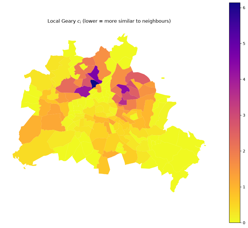
Map of local \(c_i\) values (continuous)
ax = df.plot(lg.localG, cmap="plasma_r", legend=True, figsize=(12, 10))
ax.set_axis_off()
ax.set_title("Local Geary $c_i$ (lower = more similar to neighbours)");
Map of significant clusters and outliers
In addition to the continuous values, we can map the significant clusters and outliers:
df = df.copy()
df["p_sim"] = lg.p_sim
df["labels"] = lg.labs

label_map = {1: "Outlier", 2: "Cluster", 3: "Other", 4: "Not significant"}
color_map = {
    "Outlier": "red",
    "Cluster": "blue",
    "Other": "lightblue",
    "Not significant": "lightgrey",
}
df["label_str"] = df["labels"].map(label_map)
df["color"] = df["label_str"].map(color_map)

import matplotlib.patches as mpatches

fig, ax = plt.subplots(figsize=(12, 10))

legend_handles = []

for label, color in color_map.items():
    subset = df[df["label_str"] == label]
    if not subset.empty:
        subset.plot(ax=ax, color=color)
        patch = mpatches.Patch(color=color, label=label)
        legend_handles.append(patch)

ax.legend(
    handles=legend_handles,
    title="Cluster Types",
    loc="upper left",
    bbox_to_anchor=(1.02, 1),
    frameon=False,
)

ax.set_axis_off()
ax.set_title("Local Geary: clusters and outliers (p < 0.05)", fontsize=14, pad=20)

plt.tight_layout()
Interpreting cluster types
The local Geary labels correspond to substantively different local relationships:
Cluster: a location with a small \(c_i\), meaning it is very similar to its neighbors (positive spatial autocorrelation).
Outlier: a location with a large \(c_i\), meaning it is significantly dissimilar from its neighbors (negative spatial autocorrelation).
In practice, we usually map only those observations that are statistically significant under the permutation test. The permutation test is discussed in more detail below.
The labels attribute uses the following coding when labels=True:
Label code |
Category |
|---|---|
1 |
Outlier |
2 |
Cluster |
3 |
Other |
4 |
Not significant |
Approaches for Inference & Conditional Permutations
To determine whether a local spatial cluster or outlier is statistically significant, we must evaluate its localized value against a null hypothesis. In spatial autocorrelation, the standard null hypothesis is Spatial Randomness: the assumption that the observed values are distributed entirely at random across the map, independent of geographic location.
Because the theoretical sampling distribution of local statistics like local Geary’s \(c_i\) can be highly complex and non-normal, two primary approaches are used for inference:
Analytical Inference: Assumes the local statistic follows an asymptotic normal distribution. This is computationally fast but relies on structural assumptions that often fail in small samples or highly skewed spatial layouts.
Computational Inference (Conditional Permutations): Instead of assuming an idealized distribution, a simulated null distribution is constructed empirically.
The Logic of Conditional Spatial Permutations
Global permutations reshuffle every value across the entire map. However, this is invalid for local statistics because the value of the target location \(i\) is structurally bound to the calculation. If it is included in the shuffle, we alter the very baseline we are testing.
To overcome this, Conditional Spatial Permutation operates via the following explicit steps for each areal unit \(i\):
Freeze the Core: The observed value \(y_i\) at the target location \(i\) is held constant (“conditioned” upon).
Permit the Environment: The remaining \(N-1\) values in the dataset are randomly reshuffled across all other spatial positions except \(i\).
Compute Pseudo-Statistics: The local Geary’s \(c_i\) is recalculated using the fixed \(y_i\) and the newly randomized neighboring values.
Iterate: This process is repeated \(M\) times (e.g., \(M=999\) or \(M=9999\)) to build a customized empirical null distribution for that specific location.
Calculate the Pseudo \(p\)-value: The observed \(c_i\) is compared to this simulated distribution:
Where \(k\) is the number of simulated iterations where the absolute pseudo-statistic was as extreme or more extreme than the observed local statistic.
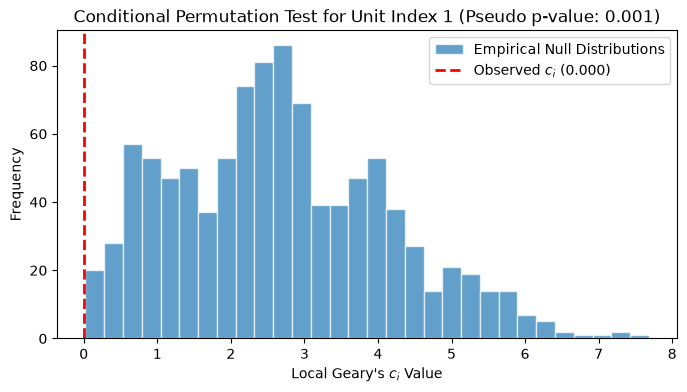
Let’s look at how we can implement and examine these empirical distributions using esda and libpysal.
lg = esda.Geary_Local(connectivity=wq, labels=True, permutations=999, seed=12345).fit(
    df["median_pri"]
)

# Visualizing the empirical null distribution for a single neighborhood
# vs its observed statistic
neigh_idx = 1  # Pick the second spatial unit
observed_stat = lg.localG[neigh_idx]
simulated_stats = lg.rlocalG[neigh_idx]

plt.figure(figsize=(8, 4))
plt.hist(
    simulated_stats,
    bins=30,
    edgecolor="white",
    alpha=0.7,
    label="Empirical Null Distributions",
)
plt.axvline(
    observed_stat,
    color="red",
    linestyle="dashed",
    linewidth=2,
    label=f"Observed $c_i$ ({observed_stat:.3f})",
)
title = "Conditional Permutation Test for Unit Index"
plt.title(f"{title} {neigh_idx} (Pseudo p-value: {lg.p_sim[neigh_idx]:.3f})")
plt.xlabel("Local Geary's $c_i$ Value")
plt.ylabel("Frequency")
plt.legend()
<matplotlib.legend.Legend at 0x7fdba362a270>
Methodological Issues and Caveats
When conducting local spatial autocorrelation tests, there are three pervasive challenges that must be taken into account during interpretation:
The Multiple Comparisons Problem
A separate statistical test is conducted for every single location on the map (e.g., if you have 140 neighborhoods, you run 140 tests). If you use a standard significance level of \(\alpha = 0.05\), you expect roughly 5% of your locations to appear “statistically significant” purely by chance (False Positives / Type I errors).
To prevent over-interpreting random variations as meaningful clusters, alpha adjustments are required:
Bonferroni Correction: A conservative approach where the target alpha is divided by the number of observations (\(\alpha_{adj} = \alpha / N\)).
False Discovery Rate (FDR): A more flexible approach that controls the expected proportion of false positives among the rejected hypotheses.
Local Statistics in the Presence of Global Autocorrelation
If a process exhibits strong global spatial autocorrelation, the baseline assumption of complete spatial randomness is technically violated from the outset. In a highly clustered map, a local unit’s neighbors are likely to be similar simply because the entire map is clustered, not necessarily because that specific location is a unique regional hot spot. This background global trend can artificially inflate the significance of local statistics.
Spatial Dependence of the Local Tests
Local statistics are inherently dependent on one another due to shared boundaries. If neighborhood A is a neighbor of neighborhood B, the calculation of \(c_A\) uses the values of B, and the calculation of \(c_B\) uses the values of A. Because their neighbor components overlap heavily across space, the resulting local tests are not independent. This violation of independence invalidates standard parametric interpretation and further solidifies why conditional random permutations are preferred over analytical calculations.
Comparing Geary’s C and Moran’s I
Both statistics detect the same broad spatial structure, but they are not identical:
Moran’s I compares each observation to the global mean; it is more sensitive to broad trends.
Geary’s C compares each observation directly to its neighbours; it is more sensitive to local differences.
When the two disagree, it usually indicates that a local cluster or outlier is driven by a very local contrast rather than a deviation from the global level.
For most applied work Moran’s I is the first choice; Geary’s C and its local form add value when you specifically want to emphasize pair-wise dissimilarity between neighbours rather than global clustering.
Takeaways
Local Geary analysis moves from a single global summary to place-specific diagnostics. This reveals where clustering and outliers are located on the map by focusing on local differences. At the same time, these local results should always be interpreted in the context of the global pattern, the choice of spatial weights, and the multiple-testing issues that arise when many local statistics are examined at once.